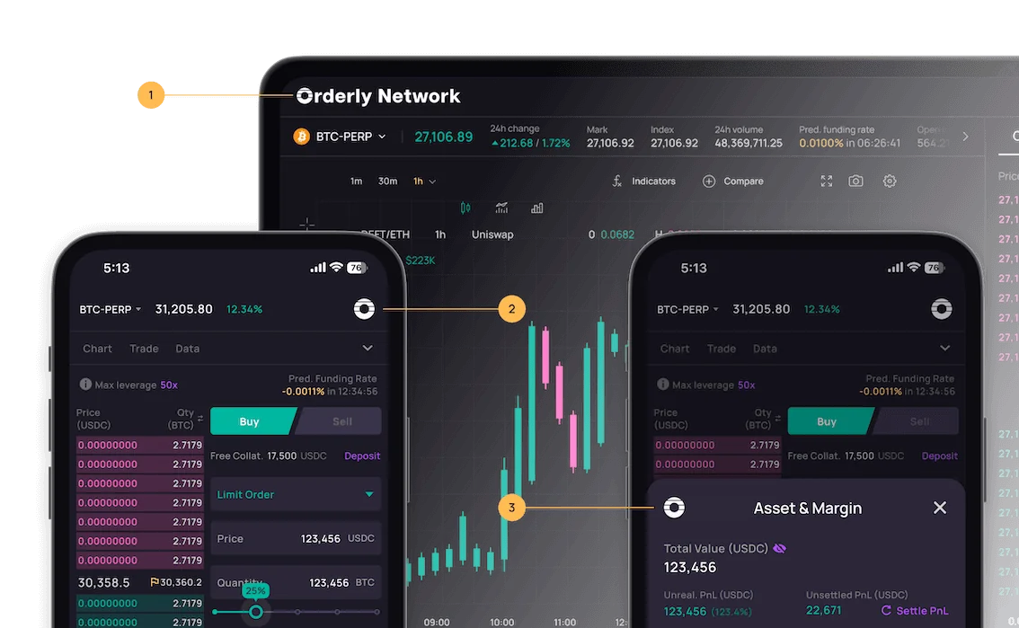
The Orderly SDK has a default theme, but you can also customize the theme yourself.Documentation Index
Fetch the complete documentation index at: https://orderly.network/docs/llms.txt
Use this file to discover all available pages before exploring further.
Default theme
Colors
The Components SDK uses the following colors:-
Besides
base, each color theme contains 3 colors:default: The default shade of the colorlight: A lighter shade than defaultdarken: A darker shade than defaultcontrastText: Text color, intended to contrast with default
-
base-contrastdefines color of texts. The library uses transparency to differentiate the importance of texts.
Typography
The Components SDK uses Manrope as the default font.Rounded
| name | size |
|---|---|
| default | 6px |
| sm | 4px |
| lg | 8px |
| full | 9999px |
Customized theme
CSS Variables
You can change the color of elements through creating atheme.css under the project. Simply add the following into the file, and import it for it to take effect:
theme.css
You can use the Theme tool that we provide to quickly
create your own theme!
Style override
The Components SDK provides the following two ways to override the style of components:class
To override the style of a certain class. For example, if we want to modify the style of abutton component, we can achieve this by selecting the element using the class selector.
For instance, to change the color of the button component:
disabled status of the button component:
id
If you want to modify the style of a specific component, you can use the id selector to define the component’s style. For example, if you want to modify the style of the “Create Order” button:ids are as below:
| id | module | description |
|---|---|---|
| orderly-deposit-confirm-button | deposit | Deposit confirm button |
| orderly-withdraw-confirm-button | withdraw | Withdraw confirm button |
| orderly-assets-margin-deposit-button | assets | Deposit button |
| orderly-assets-margin-withdraw-button | assets | Withdraw button |
| orderly-order-entry-confirm-button | order | Order entry - confirm button |
| orderly-position-cell-limit-close-button | positions | Position - limit close button |
| orderly-position-cell-mark-close-button | positions | Position - market close button |
| orderly-pending-cell-edit-button | pending orders | Edit pending order button |
| orderly-pending-cell-cancel-button | pending orders | Cancel pending order button |
| orderly-bottom-nav-bar-connect-button | bottom-nav-bar | bottom bar connect wallet button |
appIcons

main
The logo for the desktop version, it will be displayed in the top left corner of the page.img
- Type:
string - Required: false
component
- Type:
ReactNode - Required: false
className
- Type:
string - Required: false
secondary
The logo for the mobile web version, it will be displayed in the top right corner of the page and in the top left corner of the bottomSheet component.img
- Type:
string - Required: false
component
- Type:
ReactNode - Required: false
className
- Type:
string - Required: false